Plotly Choropleth — Interactive Sao Paulo Cities Map
An easy way to get a nice visualization
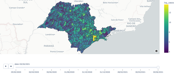
It was kind of hard to find an ideal solution for creating an interactive map of Sao Paulo cities, with dates filter , but I’ve just realized that was easier than I thought. Since I haven’t found this exact example in the web yet, I’m writing this article to help anyone who may need it.
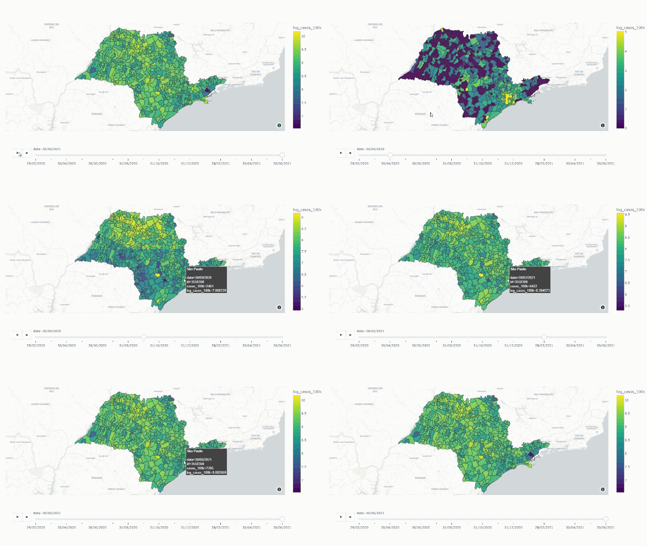
In this example, I’ll plot the distribution of COVID-19 cases in Sao Paulo cities, with a dates filter bar, wich makes possible to visualize along different dates since the beggining of the pandemic.
Our job here is quite simple, we just need to join the COVID dataset with the .json file through Plotly.
Importing libraries
import pandas as pd
import json
import numpy as np
from urllib.request import urlopen
import plotly
import plotly.express as px
It’s important to say that your plotly library must be in version 4.5.0 or higher, otherwise it won’t be able to read a geojson file. So, check it’s version running the following code:
print(plotly.__version__)If the library is in an older version, you can upgrate it by:
pip install plotly --upgradeImporting the Sao Paulo COVID-19 dataset
This dataset is avaiable in the Sao Paulo state government website: https://www.saopaulo.sp.gov.br/planosp/simi/dados-abertos/.
It’s extreamly important to get informations from official and reliable sources.
covid_cities = pd.read_csv('Data/dados_covid_municipios_sp.csv', sep=';')covid_cities.head()

From the image above, we can see that there is a feature called “codigo_ibge”, wich will be very useful in our next steps.
For a first approach, I’ll use the total number of covid-19 cases, for each city, by the end of each month. Since the very first date in the dataset is 25th february 2020, and the last one is in july 2021, we have a total of 18 months. But, I decided to drop july 2021 because there were only a few data.
So, after some data manipulation, we got the following DataFrame:
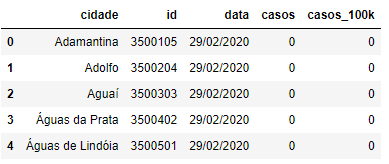
NOTE: I’ve changed the columns names:
`covid_cities.rename(columns={‘nome_munic’:’cidade’,’datahora’:’data’,’codigo_ibge’:’id’,’casos_pc’:’casos_100k’}, inplace=True)Importing Sao Paulo’s .json geographic information
Sao Paulo’s geographic information is avaiable in a .json file, that was obtained in: https://raw.githubusercontent.com/tbrugz/geodata-br/master/geojson/geojs-35-mun.json
I used the function urlopen to open the .json file:
# importing .json file and checking it
with urlopen('https://raw.githubusercontent.com/tbrugz/geodata-br/master/geojson/geojs-35-mun.json') as response:
    geo_json_sp = json.load(response)
geo_json_sp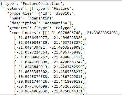
By the image above we can check that our geo_json_sp has an ‘id’ like our covid DataFrame. It’s awesome, because it’s easier to join files by cods than by names. If we didn’t have ‘id’ property in geo_json_sp, we’d probably have to make some data manipulation to get everything rightly set.
Creating the map with Plotly Choropleth
Now, we’re almost there! Just one more ajustment to make the visualization better. I’ll apply np.log() in features ‘casos’ e ‘casos_100k’, because I’ve noticed that Sao Paulo city has much more cases than other cities. So, let’s code it:
covid_cities['log_casos']=np.log(covid_cities['casos']+1)
covid_cities['log_casos_100k']=np.log(covid_cities['casos_100k']+1)
Now, the maps!
fig = px.choropleth_mapbox(covid_cities,
 geojson = geo_json_sp,
 locations=”id”,
 featureidkey = ‘properties.id’,
 color = “log_casos”,
 animation_frame = ‘data’,
 hover_name = ‘cidade’,
 hover_data = [‘casos’],
 title = “Casos de COVID-19 em São Paulo”,
 color_continuous_scale=”Viridis”,
 mapbox_style = “carto-positron”, #defining a new map style
 center = {“lat”:-22.77972, “lon”: -48.5},
 zoom = 5,
 opacity = 0.9, )fig.update_geos(fitbounds = “locations”, visible = False)
plotly.offline.plot(fig, filename = ‘sp_map_covid_cases.html’)
fig.show()
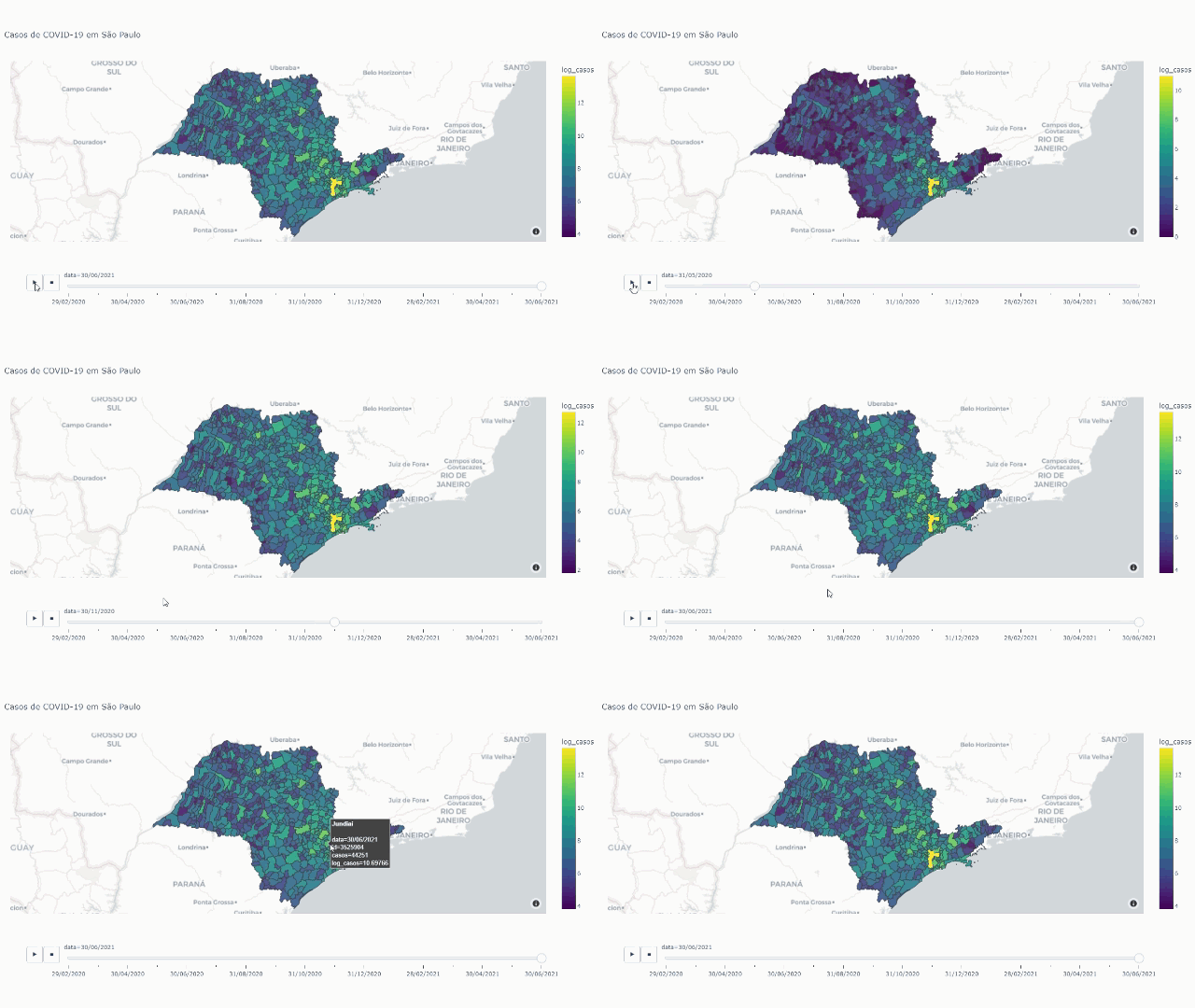
A very important note is that you’ll have to set the ‘featureidkey’ to your case. The ‘featureidkey’ indicates the key to the joint in the geojson file, while ‘locations’ does the same, but for the covid-19 DataFrame. I mean, if your key was the ‘name’, you’d have to set ‘locations’ = ‘cidade’ and ‘featureidkey’ = "properties.name" .
Now, making the same procedure, but for number of cases out of 100k habitants, we have:
fig = px.choropleth_mapbox(covid_cities,
                           geojson = geo_json_sp,
                           locations="id",
                           featureidkey = 'properties.id',
                           color = "log_casos_100k",
                           animation_frame = 'data',
                           hover_name = 'cidade',
                           hover_data = ['casos_100k'],
                           color_continuous_scale="Viridis",
                           mapbox_style = "carto-positron", #defining a new map style
                           center = {"lat":-22.77972, "lon": -48.5},
                           zoom = 5,
                           opacity = 0.9, )fig.update_geos(fitbounds = "locations", visible = False)
plotly.offline.plot(fig, filename = 'sp_map_covid_cases_100k.html')
fig.show()
Conclusion
Choropleth Mapbox is a very powerful and useful function that can help us in our daily data visualization. Also, once you get used to dealing with it, you realise it’s manipulation is not complex.
I really hope this explanation will help others with the same issues than I had! If you have any questions, feel free to leave a comment, or you can find me on Linkedin.
References
— https://plotly.com/python/choropleth-maps/
— https://www.saopaulo.sp.gov.br/planosp/simi/dados-abertos/
— https://raw.githubusercontent.com/tbrugz/geodata-br/master/geojson/geojs-35-mun.json
